


BB Events is a woman-of-color-owned-&-operated two-time award-winning creative event management studio for social impact based in the San Francisco Bay Area.
.:.
ABOUT
women-owned
bipoc-owned
bay area-based
.:.
SERVICES
brand strategy
brand development
creative direction
graphic design
marketing
.:.
CREATIVE TEAM
celïne lota
art director
graphic designer
ivellisse morales
creative director
brand strategist
copywriter
christopher bird
web developer
.:.
TIMELINE
8 months


CHALLENGE //
Becca Bloom hired Bombilla to lend our support in brand positioning as she reimagined her business & redefined her new target audiences for the types of events she’d like to coordinate moving forward. We were scoped to give BB Events a brand color refresh, website revamp & a laundry list of print & digital marketing materials, such as social media & presentation deck templates, postcards, & a service menu.
APPROACH //
We began our process by asking all the right questions to get to the core of the type of work & audience Becca wanted BB Events to appeal to with her brand refresh. From there, we conducted a brand & web audit to get a feel for her existing brand & online presence. In the process, we noticed a disconnect between her logo & accompanying icons/visual elements— they didn’t quite match up. Along with all of our scoped deliverables we did a mini logo exploration to ensure cohesion between her logo & the rest of the brand.


.:.
COLOR REFRESH
One of the first asks we received was to refresh BB Event's color palette. The original color palette was slightly muted & earthy–Becca wanted a color palette that reflected more of her bubbly, bright, & rich personality.
.:.
VISUAL IDENTITY
BB Event's original logo was inspired by Portuguese-style tiles–an homage to Becca's Brazilian heritage. This logo was accompanied by a set of minimalist icons, which upon further inspection, didn't quite align aesthetically. We made the collective decision to simplify the logo to match the minimalist style of the icons.


.:.
ICONOGRAPHY
We expanded on BB Event's icon library to provide more variety in their visual identity. In earlier discussions we had with Becca in regards to how she wanted to reposition her brand, we came up with a strategy to assign specific colors & themed icon collections to suit each of those causes in order to align with her new target market & the types of events she wanted to plan moving forward.


.:.
RESILIENCE RESET
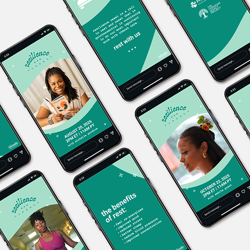
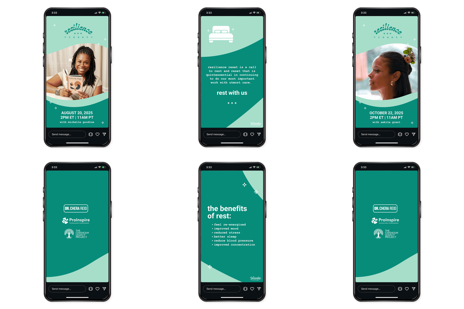
We adapted some of Fellowship's brand identity when developing a sub-brand identity for a virtual series called 'Resilience Reset.' This series offers guided meditation sessions that celebrate rest as a revolutionary practice where busy individuals are invited to take time away from the demands of their busy days to create space for self-grounding in collective care.

.:.
REFLECTION
Working on BB Events was such an amazing experience– I'm grateful & honored for the amount of trust that was given to my team & I to take an already beautiful & well-established brand identity, & see it through a transformation of growth & elevation with new & redefined meaning.


